


Mastering the Art of Web Design (Part 1)
Create Stunning and Effective Websites by Unlocking the Power of Design Rules


Introduction
There are not many people who are good at both writing code and designing, therefore, this will set you apart from many developers out there.
Before covering different design rules one after the other, let us define what Web design is, why it's so important and also how everyone can learn web design.
What is the difference between web designers and web developers?
Web designers are those who create the overall look and feel of a website while on the other hand Web developers are those who implement the design using HTML, CSS and JavaScript code.
Why take design Seriously?
A good design creates an immediate and lasting good impression of the brand or product.
A good design makes the user trust the brand right away.
A good design increases the user's perceived value of the brand or product.
A good design gives users exactly what they were looking for when coming to the site, eg. purchasing a product or finding information.
Good web design is not subjective or creative and everyone can learn the basics by following a framework/system.
Web Design rules (ingredients) we will cover in the course.
Typography - formatting and designing text.
Colors
Images/Illustrations
Icons
Shadows
Border radius
Whitespace
Visual Hierarchy
User Experience
Components/Layouts
Before getting into the rules for each design ingredient, it is worth noting that different websites have different personalities hence each ingredient is used differently as per the website's personality.
We will then have a sneak peek into different website personalities to then later cover each design ingredient (rule).
- Serious/Elegant

Used to convey luxury and elegance, based on thin serif typefaces, golden or pastel colors, and big high-quality images.
- Minimalist/Simple

Focuses on the essential text content, using small or medium-sized sans-serif black text, lines, and a few images and icons.
- Plain/Neutral

This one gets out of the way by using neutral and small typefaces, and a very structured layout and is commonly used in big corporations.
- Bold/Confident

Makes an impact, by featuring big and bold typography, paired with confident use of big and bright colored blocks.
- Calm/Peaceful

Used for products and services that care about the consumer, transmitted by calming pastel colors, soft serif/sans-serif headings, and matching images/illustrations.
- Startup/Upbeat

Used widely in startup companies, featuring medium-sized sans-serif typefaces, light-grey text and backgrounds, and rounded elements.
- Playful/Fun

Colorful and round designs are fueled by creative elements like hand-drawn icons or illustrations, animations, and fun language.
The above is just an overview of different website personalities but the idea is that different design rules will depend on which personality you wanna use.
Let's now cover each different design rule (ingredient):
A. TYPOGRAPHY
Before getting into typography, there are two concepts we need to know:
i) What is Typography?
Let's first learn what typography is. According to Wikipedia, Typography is the art and technique of arranging type to make written language legible*, **readable and appealing** when displayed.* In other words, typography is all about making text beautiful and easy to read.
ii) Serif Vs Sans-Serif Typefaces
Serif Typeface has extra details in each character, often referred to as serifs (tails). They create a traditional/classic look and feel conveying trustworthiness and are good for long text. Sans-Serif Typeface has no extra details in each character hence looks clean and simple. They give a modern look and feel and are easier to choose for beginner designers.

- Rule 1 - Use good Typefaces
a) Use only good and popular typefaces and play it safe (which means, do not choose crazy or weird typefaces.)
Examples of Sans-Serif typefaces that are highly recommended for use:
Inter
Open Sans
Roboto
Montserrat
Work Sans
Lato

The above Sans-Serif typefaces are free and can be found in Google Fonts and Fonts Squirrel.
Examples of Serif typefaces that are highly recommended for use:
Merriweather
Aleo
Playfair Display
Cormorant
Cardo
Lora

The above Serif typefaces too are free and can be found in Google Fonts and Fonts Squirrel.
b) It's okay to use just one typeface per page! If you want more, limit to 2 typefaces.
c) Choose the right typeface according to your website personality.
- Rule 2 - Use good font sizes and weights
a) When choosing font sizes, limit choices to make 'your life easier'. Use a "type scale" tool or other pre-defined range of font sizes. eg.
/*
FONT SIZE SYSTEM (px)
10 / 12 / 14 / 16 / 18 / 20 / 24 / 30 / 36 / 44 / 52 / 62 / 74 / 86 / 98
*/
b) Use a font size between 16px and 32px for "normal" text.
c) For long text (like a blog post), try a size of 20px or even bigger. This is because, if the user needs to read something like a blog post, it's gonna be far easier if the text is a little bit bigger.
d) For headlines, you can go big (50px+) and bold (600+), depending on your personality.

e) For any text, don't use a font-weight below 400(regular). The text will be light/really light and hence difficult for the user to read.
- Rule 3 - Create a good reading experience
a) Use less than 75 characters per line.

b) For normal-sized text, use a line height between 1.5 and 2. For big text, use below 1.5. The smaller or longer the text, the larger the line height needs to be!
c) Decrease letter spacing in headlines, if it looks unnatural(this will come from experience).

d) Experiment with all caps for short titles. Make them small and bold and decrease letter spacing.

e) Usually, don't justify text.

f) Don't center long text blocks. Small blocks are fine.

B. COLORS
The next very important web design ingredient, which needs a lot of thought and consideration, is color. Working with color can be hard because there is something called color theory which is quite complex. However, fortunately, you do not need to learn color theory to create great designs.
- Rule 1 - Choose the right color
a) Just like in typography, make the main color match your website's personality: colors convey meaning.

b) Use a good color tone! Don't choose a random tone or CSS-named colors.
Don't just go into your VS Code color picker and choose a random tone there, or even worse, just use one of the CSS-named colors. Instead, there are multiple tools one can use: i) Open Color ii) Tailwind CSS iii) Flat UI Colors 2
- Rule 2 - Establish a color system
a) You need at least two types of colors in your color palette: a main color and a grey color.


Looking at the example above, the main color is the green-blue color while the grey color is the dark blue. It being called a grey color does not necessarily mean it has to be a true 'grey'. It can also be a very dark version of another color.
In many designs, having a main and a grey color is more than enough. However, if you want to take it a step further and add a bit more complexity to your design, (comes with experience), you can add more colors.
b) With more experience, you can add more colors: accent (secondary) colors; (use a tool).
The accent color should not just be any random color, but there needs to be a relationship between the main and the accent color(s). Therefore, you need to use some tools to choose your accent color.

c) For diversity, create lighter and darker "versions"(tints and shades) of the main, grey and accent color(s).

This is especially important for grey colors as you will need different grey tones for text in different places and also at different states (eg. different button states). The tools listed above: Open Color, Tailwind CSS, and Flat UI Colors 2 come with tints and shades included but if you use some other tool or came up with the color yourself, you can also create tints and shades using a tool known as Tint & Shade Generator.
d) Use a tool to come up with a color system to avoid creating a random second color. Some of the tools that can generate entire color palettes include Paletton and Coolors.
- Rule 3 - When and How to use colors
a) Use your main color to draw attention to the most important elements on the page (eg. button(s) and logo).

b) Use colors to add interesting accents or make entire components or sections stand out.

c) You can try to use your color strategically in images and illustrations.

- Rule 4 - Colors and Typography
a) On dark colored background, try to use a tint of the background ("lighter version") for text.

b) Text should usually not be completely black. Lighten it up if it looks heavy and uninviting to read.

c) Don't make text too light! Use a tool like Coolors to check the contrast between text and background colors.
- The contrast ratio needs to be at least 4.5:1 for normal text and 3:1 for larger text (18px+).

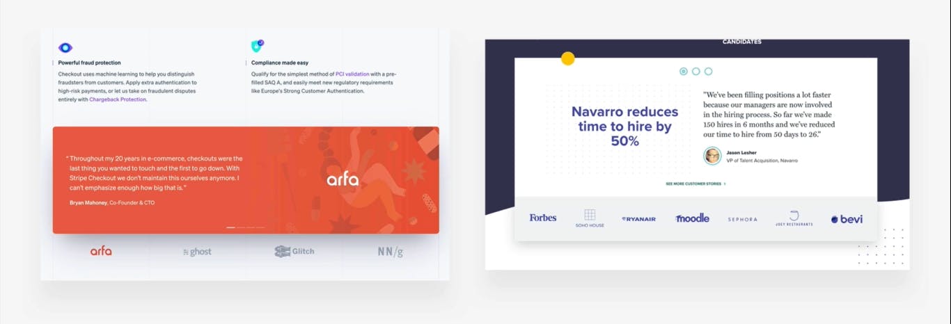
C. IMAGES AND ILLUSTRATIONS
Besides text, images are the most important content of any webpage. Let's then learn how we can use images well, when to use images and what images to use.
- Rule 1 - Use Good Images
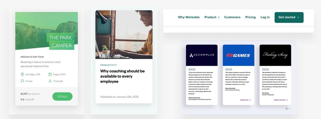
a) Different types of images: product photos, storytelling photos, illustrations, and patterns.
i) Product photos - They are to basically illustrate the product that you're trying to sell on your website.

ii) Storytelling photos - They basically help convey the message of your website without showing the product, but rather a person using the product or the service.

iii) Illustrations - This mode is getting more and more popular these days for it can be made in many different styles. They are basically a more abstract way of storytelling. They add a lot of originality to a website in the form of either 2d illustrations or 3d illustrations.


iv) Patterns - These might appear kind of as a background of entire sections or might also appear behind images in order to add some interesting visual detail and a little creativity to your website (makes it less boring - if not overused).

b) Use images to support your website's message and story. So only use relevant images!


c) Prefer original images. If not possible, use original-looking stock images (not generic ones!).


Users look a lot more for authenticity than for polish hence images like the ones below should never be used as they look fake and overproduced.

The best platforms to get original-looking images and/or illustrations for your site include Unsplash, Pexels, DrawKit, Storyset, unDraw and Freepik.
- Rule 2 - Use Images well
a) Try to show real people to trigger the user's emotions. These days, people want to connect with real images and not some fake overproduced models, hence you can use that to your advantage.

b) If necessary, crop images to fit the message.

c) Experiment with combining photos, illustrations and patterns to create interesting details and some interesting effects.

- Rule 3 - Handling Text on Images
a) Darken or brighten the image (completely or partially, using a gradient) where the text is.

b) Position text into a neutral image area.

You can use a continuous background area on the image and place your text, but the point to consider is what happens when the images get smaller on a mobile screen, to avoid the text being overlayed with the rest of the image.
c) Put text in a box. This works super well, more so when you decide to add some opacity to the box.

- Rule 4 - Some Technical Details
a) Account for resolution screens, hence make image dimensions 2x as big as their display size.

Scale factor: Actual pixels the screen contains / Pixels represented on the screen. On high-res screens, the scale factor is 2x or even 3x; on "normal" screens, it's just 1x (1 physical pixel = 1 design pixel). (You don't need to know the technical details of the rule above but rather to understand how it works).
When the rule above is not observed (...make image dimensions 2x as big as their display size), the image might look okay on a low-res screen but will appear blurry on a high-res screen.

b) Compress images for lower file size and better performance for your website and the users.

A super awesome tool (image above) for compressing images is Squoosh.
c) When using multiple images side-by-side, make sure they have the exact same dimensions/aspect ratio.


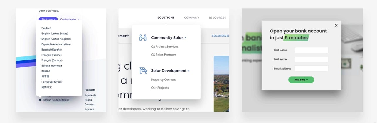
D. ICONS
Icons can add a lot of detail and can completely change the look and feel of an entire page or application and that is why it is super important to know how to use them properly.
- Rule 1 - Use Good Icons
a) Use a good icon pack and not simply some random icons that you find online; there are tons of free and paid icon packs online. Some of the best free preferred platforms for icon packs include phosphoricons, ionicons, heroicons, and icons8. You do not even need to add an external icon pack but can simply use emojis as well.
b) Use only one icon pack. Don't mix icons from different icon packs. This is because an icon may seem completely different from the rest and can be really distracting taking the user's attention away from your content by making them keep on looking at that off and weird icon.

c) Use SVG format icons or icon fonts. Don't use bitmap image formats (.jpg and .png)! The SVG icons are called vector-based hence we can scale them indefinitely without them getting pixelated or unsharp no matter how big we make the icons. On the other hand - Bitmap, they do not scale and they become unsharp as we make them bigger.

Additionally, using images from Google directly is many times in violation of copyright laws.
d) Adjust to website personality! Roundness, weight and filled/outlined depend on typography. Use an icon pack that has a similar roundness and weight to your typography.

Some website personalities might not need icons at all like the minimalist or bold personalities.
- Rule 2 - When to use Icons
a) Use icons to provide visual assistance to text. This helps to scan and understand the text and also provides some interesting visual detail and visual assistance to the text itself.

b) Use icons for building product feature blocks. The goal of feature blocks is to basically describe the features of a certain product or service. Icons in that are really helpful as when they are well chosen, the user doesn't really have to read the text.

c) Use icons associated with actions, and label them (unless there is no space or an icon is 100% clear). This provides visual assistance to the text and the user is able to understand what each action is doing. Additionally, when building some navigation, you should be consistent, and not use only icons for some of the elements and use only text for the others.

d) Use icons as bullet points (Some small checkmarks). This can be a nice way of adding some more visual detail to your design.
- Rule 3 - Use Icons well
a) To keep icons neutral, use the same color as the text. To draw more attention, use a different color.

b) Don't confuse your users: icons need to make sense and fit the text or action!
c) Don't make icons larger than what they were designed for (This can however be a little bit subjective, and might be hard to perceive). If needed, enclose them in a shape. However, some icons were clearly designed to be used in a big way and can be identified by a lot of details they contain and thin lines which keeps the icons light as we scale it up.

E. SHADOWS
Shadows can play an important part in helping users figure out the relationships between parts of our designs or can also be used to add interesting visual details. However, let's learn how we can use shadows in design to our advantage.
Let's start this section with some concepts first, a very brief history of shadows in user interface design.
Back in the days around 2010, all interfaces on mobile and on the web used a Skeuomorphic design, which was full of realistic details, glossy effects and lots of shadows. Then after some time, Windows 8 and iOS 7 came along and introduced the idea of flat design. There were no more realistic details or glossy effects or shadows. Everything was simply reduced down to the essentials which is why this design is also called Minimal.
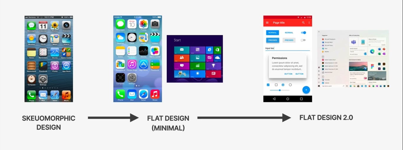
However, the flat design came with some usability problems hence Flat Design 2.0 has emerged. It was still minimal without the realistic looking details but it did bring back some shadows and depth to user interfaces. Shadows basically stimulate depth in user interfaces allowing us to create a third dimension to our designs. And that's the whole reason why we use shadows in UI design.
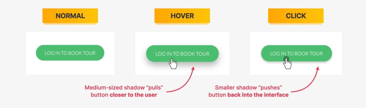
The more shadow that we add to a certain element, the further away from the screen or from the user interface that element will seem and we can use shadows on both boxes and text.
- Rule 1 - Use Shadows Well
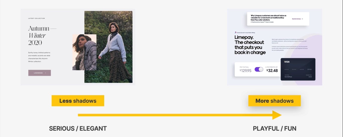
a) You don't have to use shadows! Only use them if they fit your website personality. Example - In Serious/Elegant personality, we use fewer shadows and many times no shadows at all, but the more playful or fun a design gets, the more shadows it will also use.
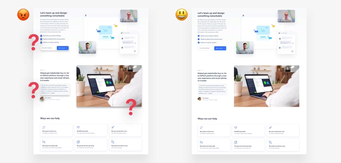
b) Use shadows in small doses. Don't go ahead and add shadows to every single element on the page because that will just be confusing. In some cases, it might not make a lot of sense, since adding shadows to every single element, would be like adding shadows to no element at all. Because if all elements have shadows, then basically that doesn't create any visual hierarchy between these different elements.
c) Go light on shadows and don't make them too dark. Using too dark shadows makes the design look unnatural because they actually don't exist in the real world and is one of the easiest ways to completely ruin an entire design.

- Rule 2 - Use Shadows in the Right Situation
a) Use smaller shadows for smaller elements that we simply want to stand out from the page (to draw attention to). Example - call to action buttons, input sections etc.
b) Use medium-sized shadows for larger areas that should stand out a bit more. This technique of using medium size shadows is used all the time to make entire sections completely float above the page. Basically to make them stand out from the rest of the page.
Another common application of medium size shadows is to make cards stand out from the rest of the interface eg. product cards.
c) Use large shadows for elements that should really float above the entire rest of the interface. Examples - navigations and popup windows.
d) Experiment with changing these types of shadows in different situations eg. mouse interaction like click and hover. This effect can actually help create a very natural feeling interface.
e) Experiment with glows (colored shadows). This is a modern effect where shadows don't always have to be black. If we give them a certain color they make the element kind of glow.

Milestone Wrap...
Aha! Here we go...🚀
We're done with Part 1 of 'Mastering the Art of Web Design'. Just to recap, we have covered different design rules which include how to work with Typography, Colors, Images and Illustrations, Icons and Shadows. In the next section, (Part 2), we will cover how to work with Border radius, Whitespace, Visual Hierarchy, User Experience, and an intensive section on Components/Layouts.
Are you excited? I am excited 🥳
See you then 🤗